Published: May 9, 2020 by Bernardo Gomes
The 2019 Inkvent Calendar Inks are now available individually in 50ml bottles and they are a work of art.
Some point in time before the lockdown and after Brexit, Scribble Monboddo the man of many blogs, pens and inks decided that it was time to rest the pen of one of his blogs, maybe the most iconic one and the Fountain Pens UK community felt the hit.
Luckily the lockdown and the release of the Inkvent Inks Blue series made him reconsider and made a call for one last meta review, and we all hope it isn’t United Inkdom’s last hurrah.
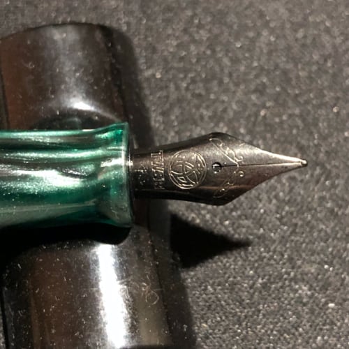
So, I volunteered and put pen to paper to write about them as I was one of the lucky ones to manage to get the Inkvent Calendar last Christmas. With 25 inks to test, I decided to review the standard and sheen ones as shimmering inks aren’t my thing.
The Standard Inks:
There are 12 inks in this category and some gems can be found here like Candy Cane, Purple Bow and Ho Ho Ho. They are my favourite of the lot but don’t get fooled by my preference as there are rather attractive inks for all tastes in the lot.
Candy Cane: Are you looking for a bright ink, like an ink that will draw more attention than Jason Momoa or Scarlet Johanson in the red carpet? Look no further, this is your ink. This is the closest to a bright Magenta, the colour our brains invented, that I’ve ever seen. Forget Diamine Magenta or Hope Pink, this IS the real deal. Want an ink for a love letter? You guessed right, this one.
Elf: A solid and classic green, nothing like that cheesy movie with the same name. This is a great choice if you are looking for a strong and deep green.
Fire Ember: Do you like a bold red, Formula 1 or cars, well this is the red that is inked in my Sheaffer Ferrari. Yep, a super nice red, close to Ferrari Red than anything I’ve seen. A bright red with a hint of yellow and orange that if I ever get back to teaching, this will be my grading ink.

Gingerbread: I need to start this with a disclaimer, I don’t like brown. Everyone I know knows that brown is a colour that means nothing to me is like meh. So with this said, lets continue with the review. Do you like the taste of gingerbread, I do. But this ink isn’t spicy and fiery like gingerbread, it is a plain brown and it does shade at least.
Ho Ho Ho: This one is THE red. It is a bold, bright, IN YOUR FACE PUNK! red. On my top 5 list of reds. Need to say more?
Mistletoe: A beautiful earthy green that ticks all the boxes when looking for a warm green. I do like it and this is in my list of the inks I’ll buy the 50ml bottle. Get it!

Mulled Wine: Wine check, Mulled Wine check. Writing with this ink made me feel like I was writing with wine so, I poured a glass and kept going. Love it.
Nutcracker: Is brown and boring, unless you like brown. Next!
Poinsettia: A nice red, suitable for school, College, Uni, work you name it.

Purple Bow: All Hail the Queen of the standard inks, bow in its presence. Deep rich purple that relates to FPUK Mondboddo’s Hat.

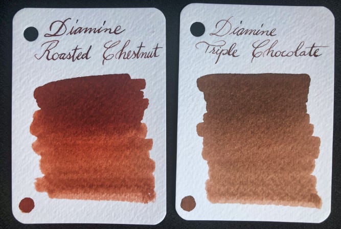
Roasted Chestnut: A deep warm brown with a shade here and there.
Triple Chocolate: Ok, that is enough brown in my life for the next 10 years! Jokes aside, this reminds me of nice cup of cocoa by the fire.
The Sheening ones:
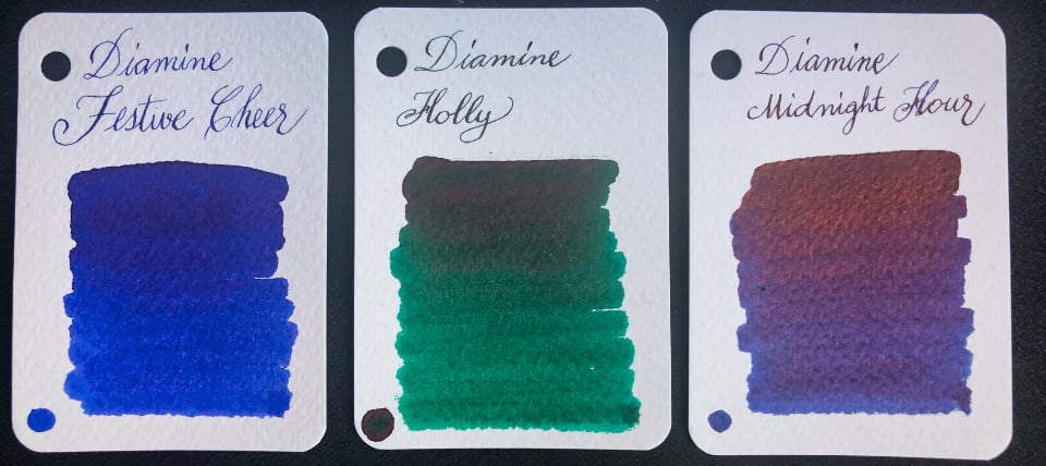
Festive Cheer: Deep blue with a copper sheen, this ink leans towards purple as well. Not much shading but the sheen… Wow!
Holly: A greenish teal with a bright magenta sheen. Wonderful ink that will make the 50ml bottle in my collection.
Midnight Hour: Another Deep Blue/Purple ink with a strong copper sheen that in the sun is more purple than blue. A fantastic colour with shapeshifting, I meant colour-shifting properties, a winner in my book.
Noel: Dark Red with golden green sheen, sign me up for more! On certain papers (Rhodia and Tomoe River) you can even see some pink when using a broad or flex nib. My go to red for Mother’s day and Christmas cards.
Polar Glow: Dark blue with a purple sheen… or is it magenta? Lets say it is both ok. On bright light, specially sunlight, this sheen “pops”, a beauty.
Seasons Greetings: The best for the last. Teal ❤️ with loads of sheen, by far my favourite. The magenta sheen shows on all its glory when the paper is hit by some bright light. A wonder to the eyes.